
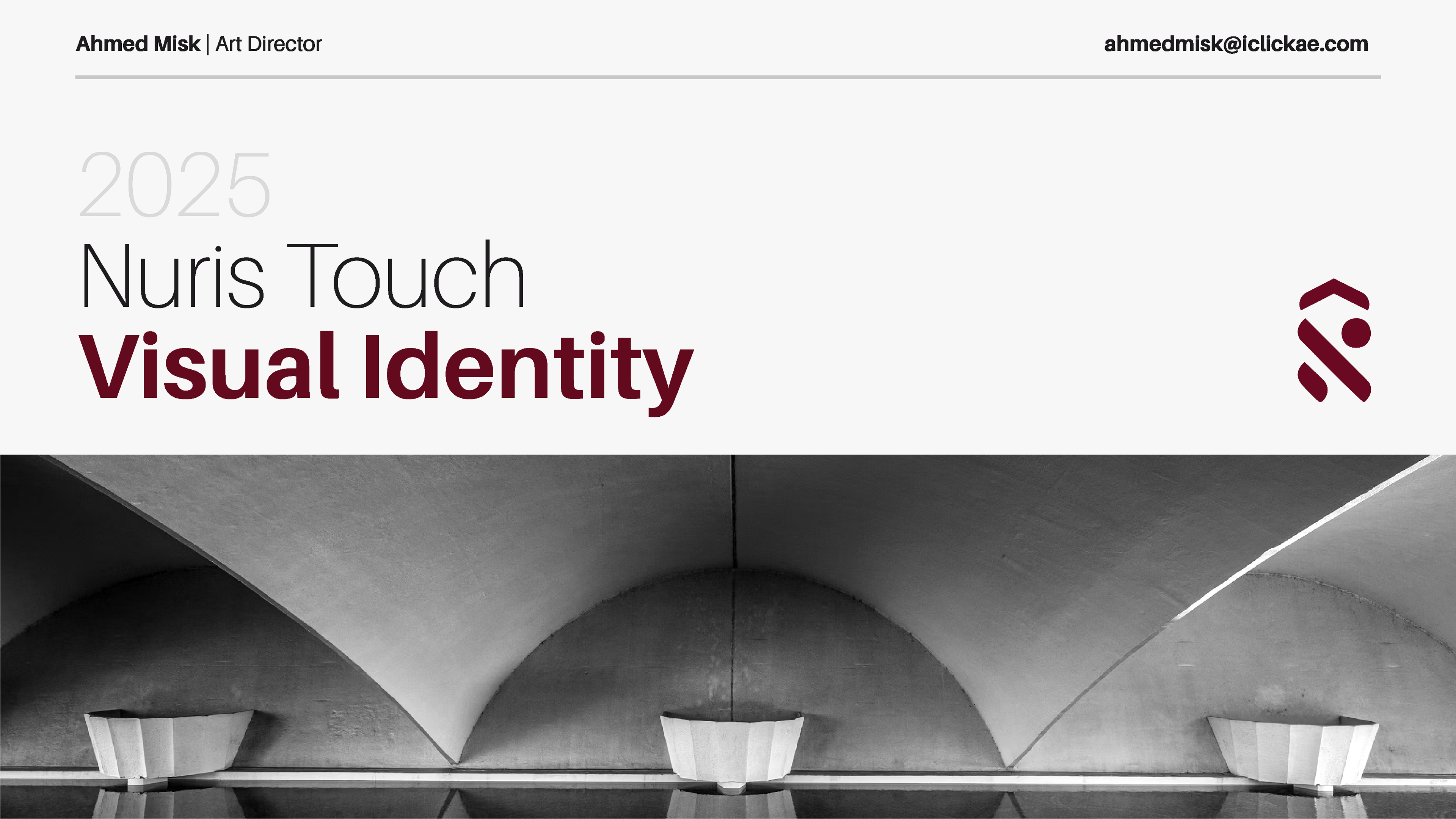
Nuris Touch is a high-end interior design house based in Dubai, UAE, known for its refined and modern approach to creating bespoke spaces. The brand’s identity was carefully crafted to reflect its sleek, contemporary style while distinguishing it in a highly competitive market.
Challenges:
Competitive Market: Dubai’s interior design industry is saturated, with many competitors relying heavily on the conventional black-and-gold aesthetic to signify luxury. Nuris Touch needed a fresh and unique identity to stand out.
Brand Recognition: Establishing a memorable and visually distinct brand that resonates with the multicultural audience in Dubai while appealing to both local and international clients.
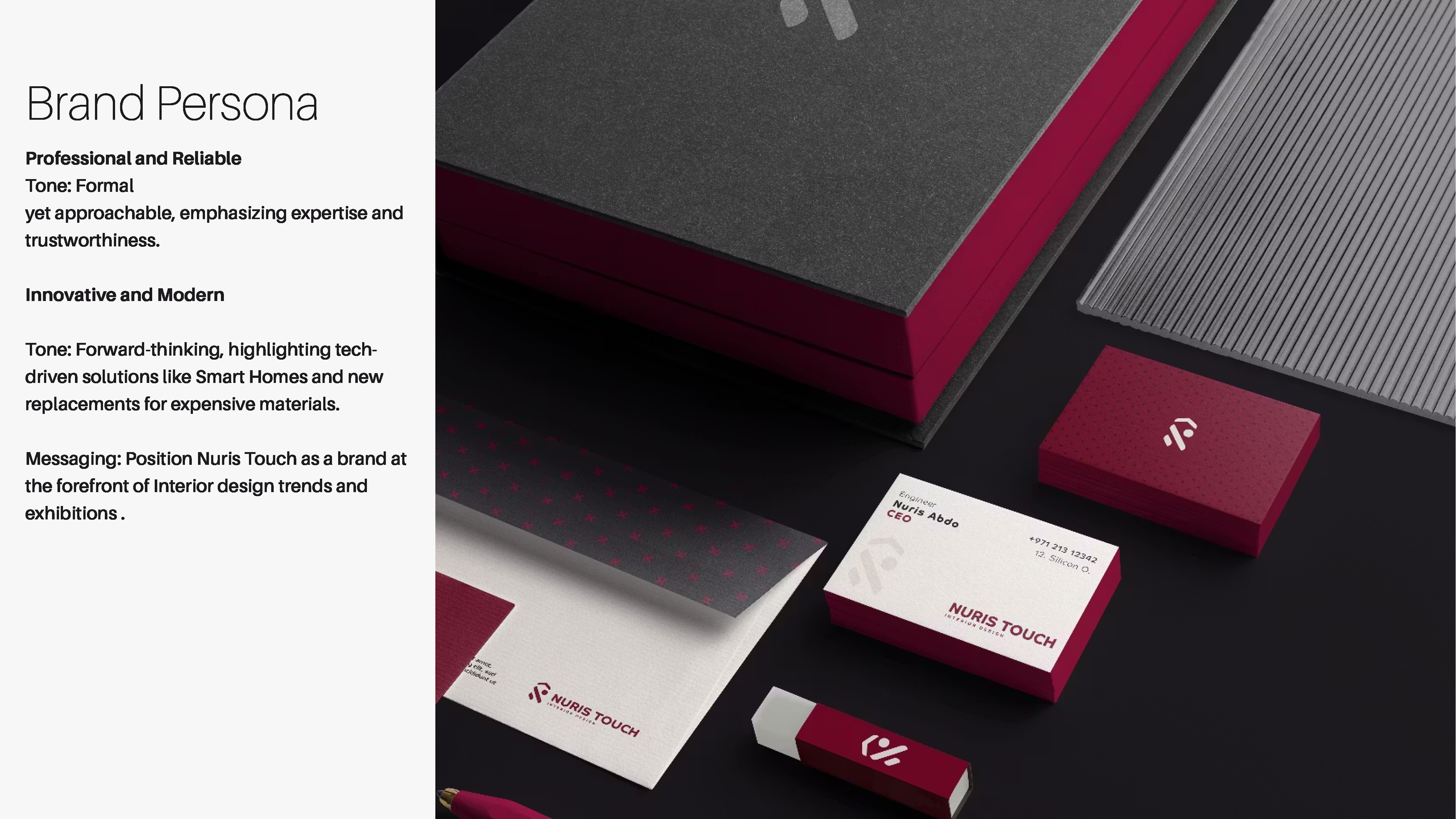
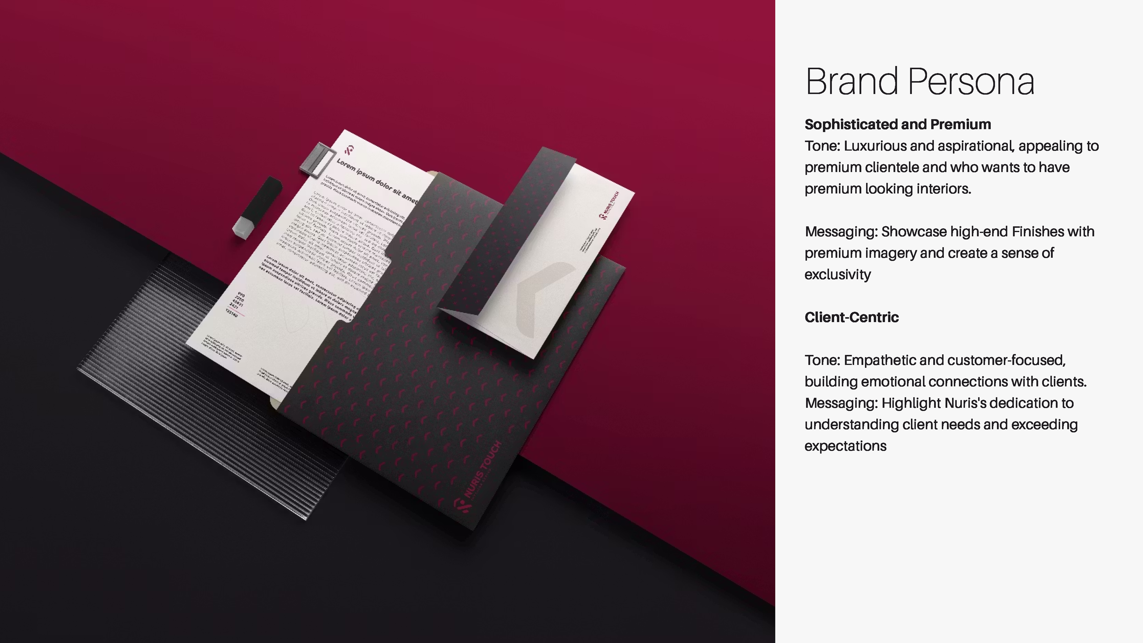
Balancing Sophistication and Approachability: The brand required a visual identity that exuded modern elegance without alienating potential clients with overly rigid or traditional designs.
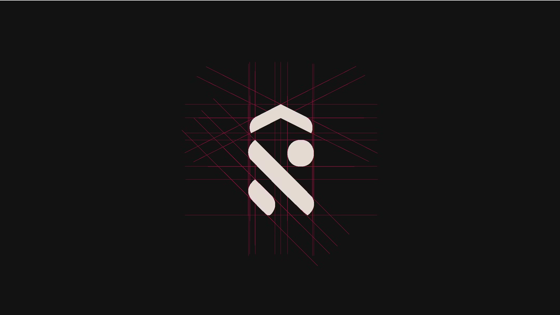
Logo Design:
The logo design was crafted to embody the brand’s essence: sleek, modern, and memorable.
The logo design was crafted to embody the brand’s essence: sleek, modern, and memorable.
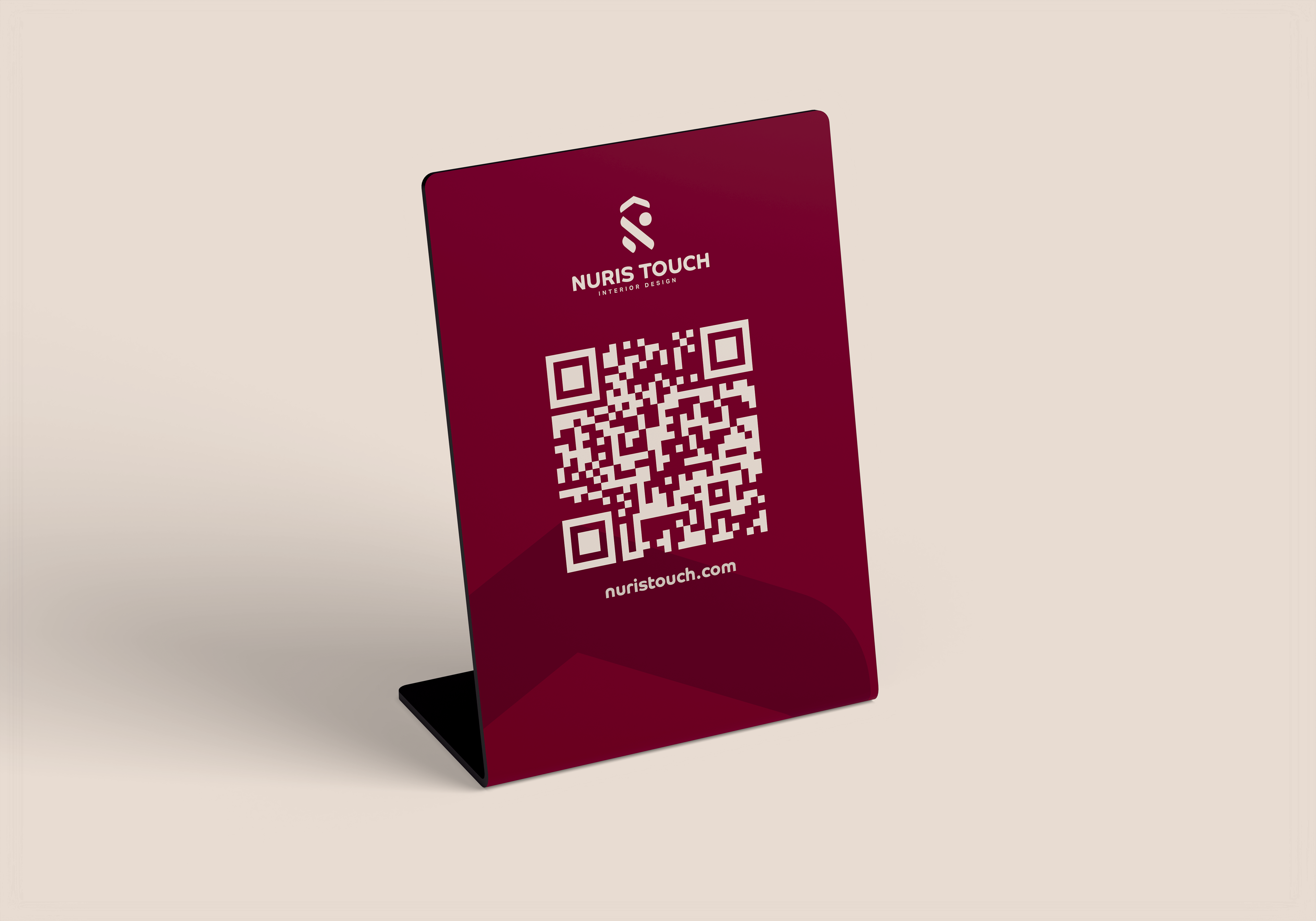
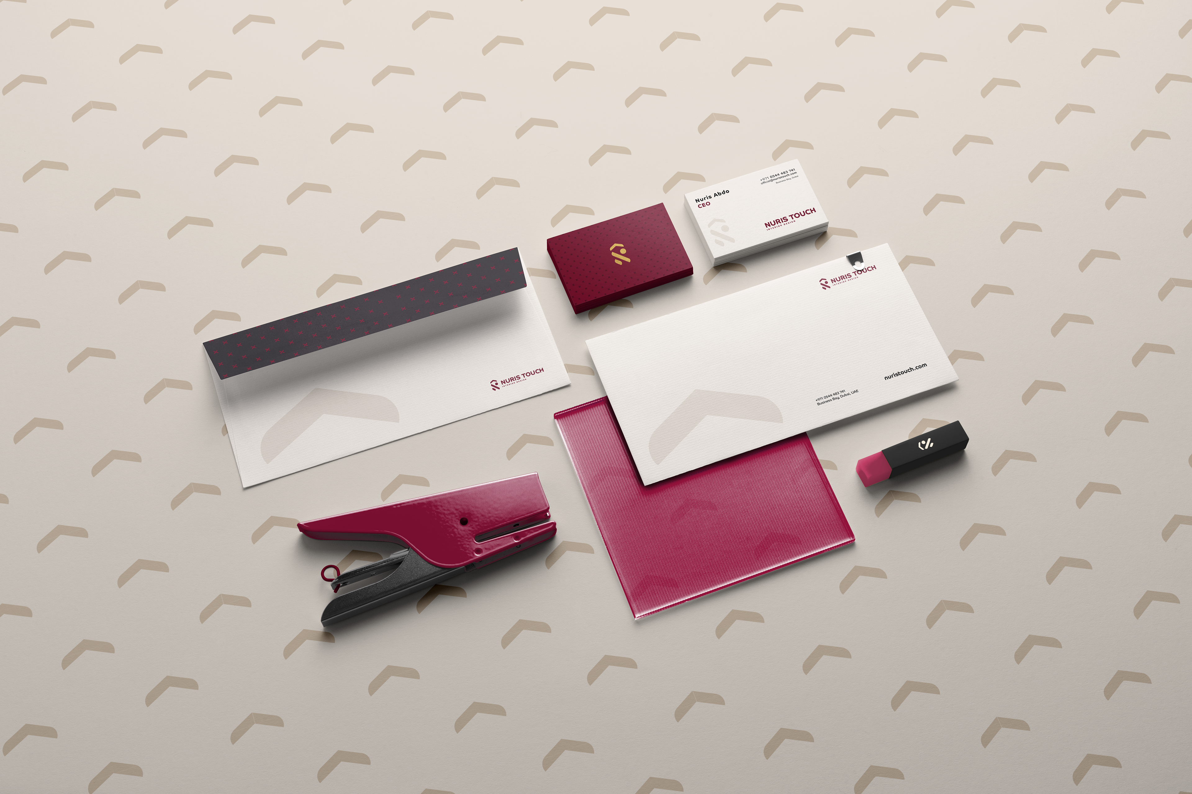
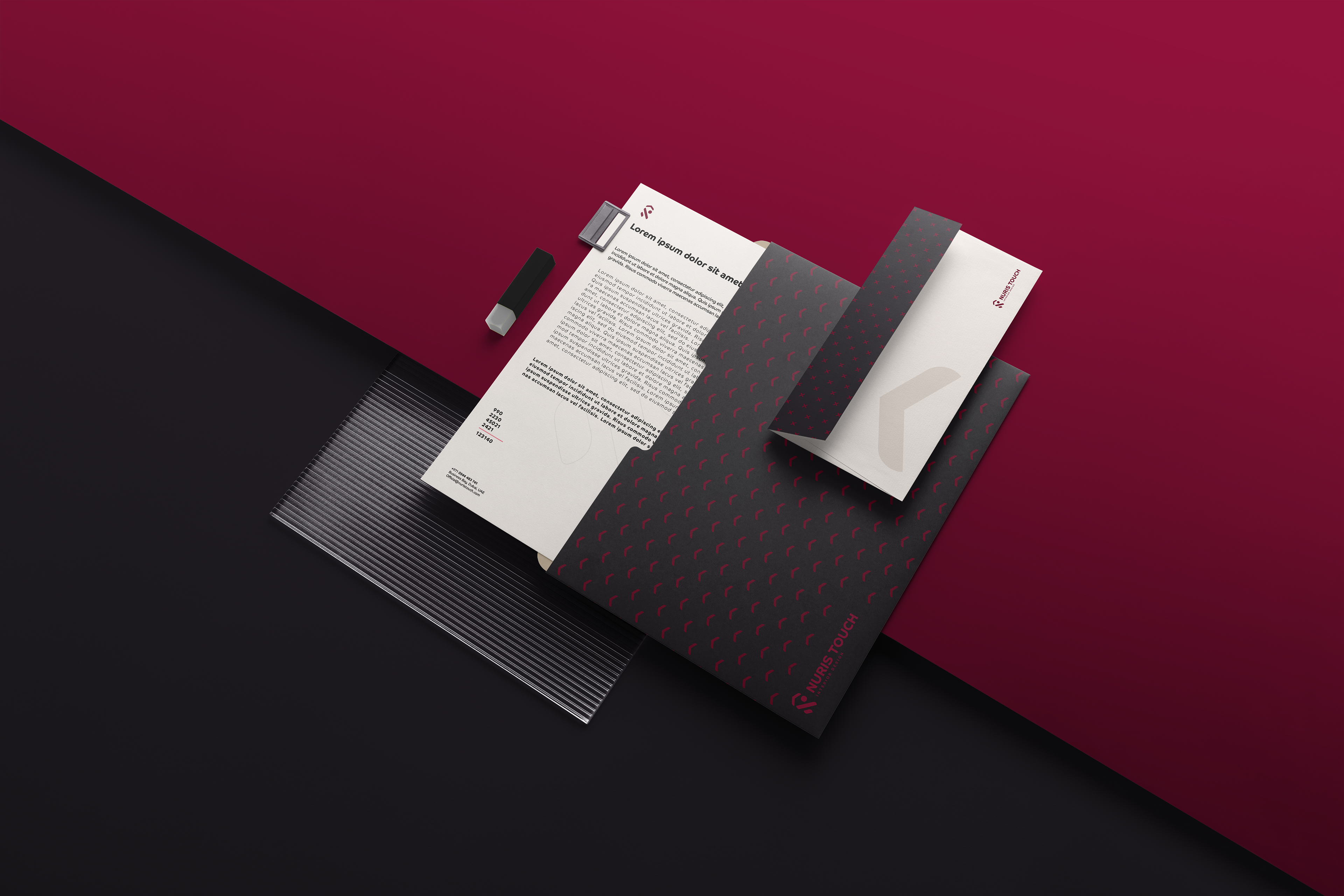
Concept: A creative combination of the letter N and a house shape was used to represent both the brand’s name and its core service—creating beautiful, functional interiors.
Design Approach: Clean lines and geometric shapes were employed to emphasize modernity and structure.
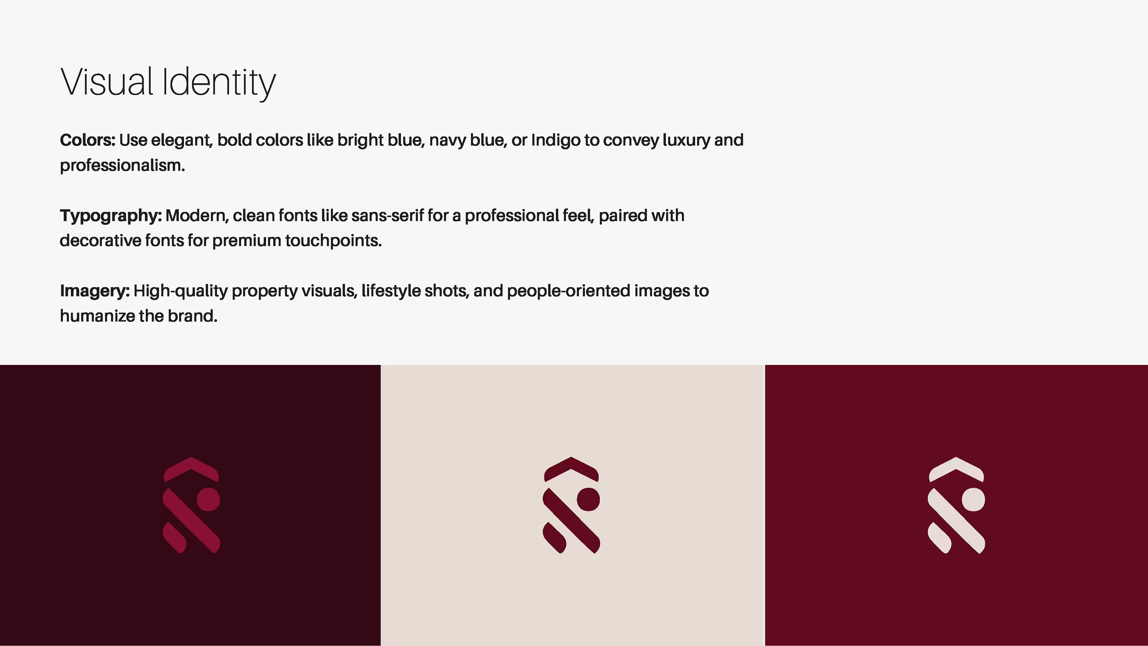

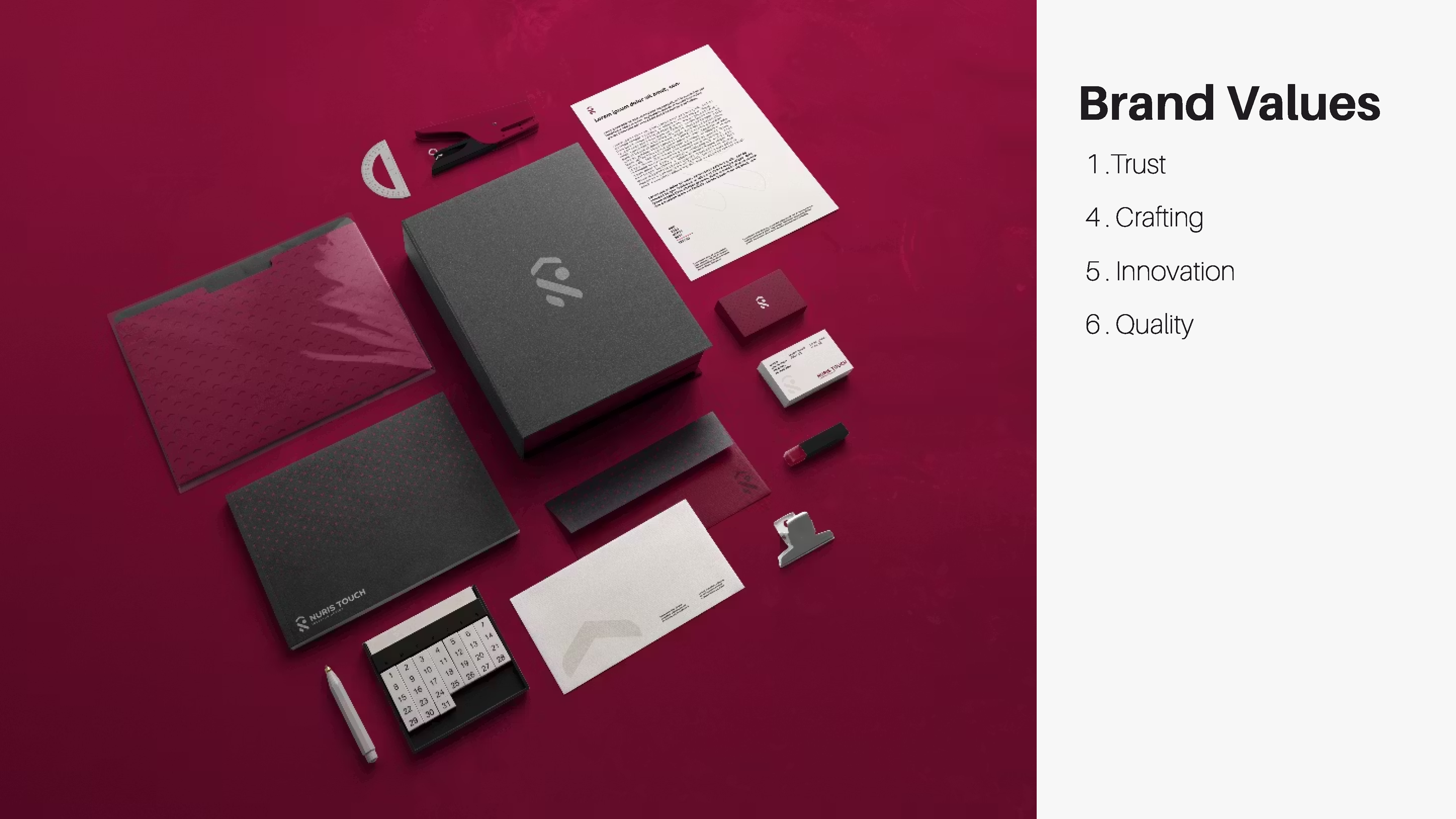
Color Palette:
Main Colors: We chose burgundy red and black as the brand’s primary colors to differentiate it from competitors who predominantly use black and gold. Burgundy conveys sophistication and depth, while black adds a timeless, modern touch.
Secondary Color: Creme was introduced to soften the palette and provide balance, making the brand approachable and versatile.
Gold Accents: Subtle gold accents were incorporated into print materials for a premium finish, ensuring a luxurious feel without dominating the brand’s aesthetic.

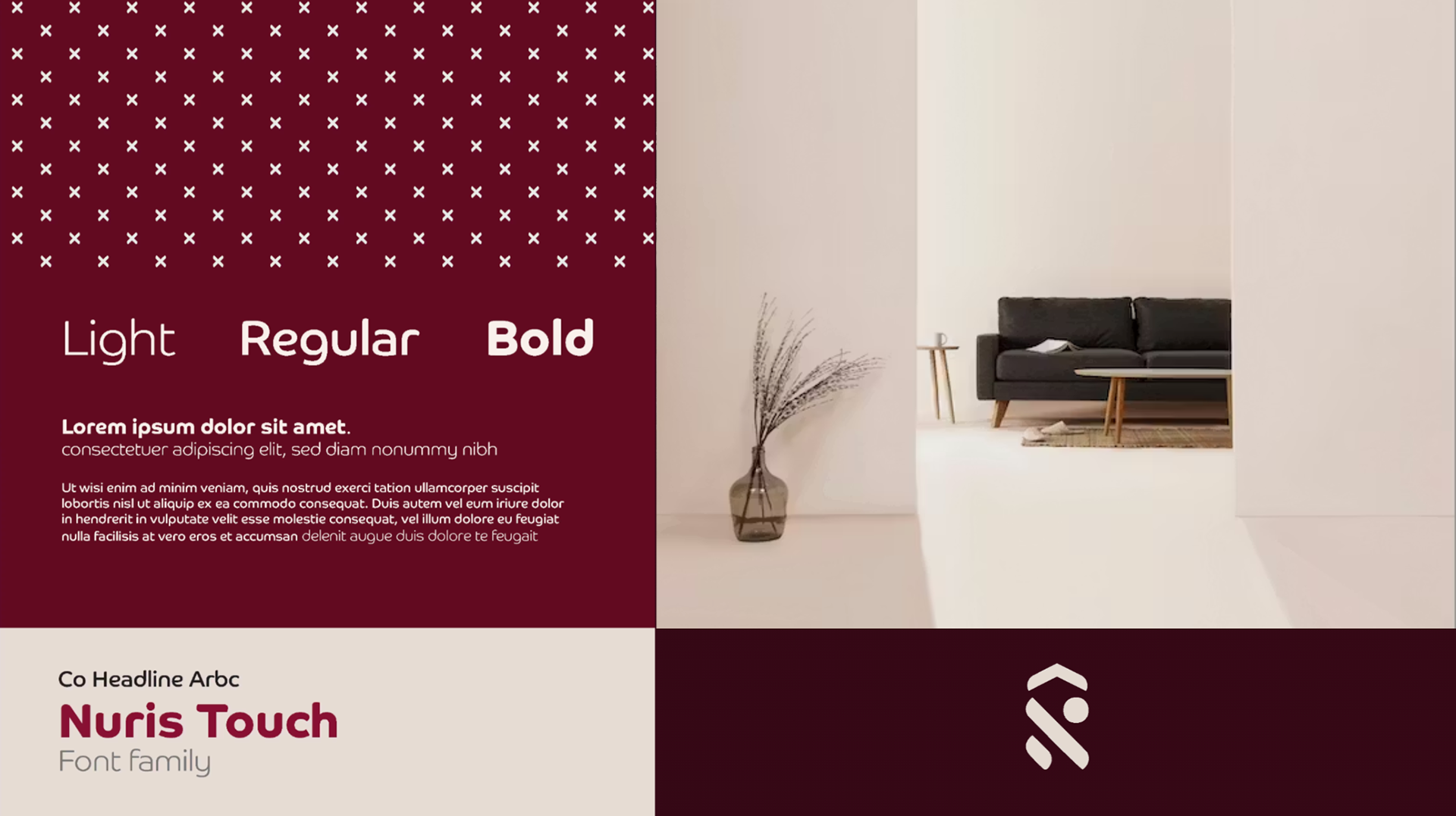
Typography Selection:
We selected CoHeadline Arabic as the brand’s primary font for its bilingual capabilities, perfectly suited for Dubai’s multicultural environment.
The font’s straight lines and curved edges created a balance between precision and elegance, aligning with the brand’s identity.
Key Outcomes:
Nuris Touch branding successfully positioned the interior design house as a innovator in the market:
Nuris Touch branding successfully positioned the interior design house as a innovator in the market:
Differentiation: By breaking away from the overused black-and-gold trend, Nuris Touch stood out with its bold burgundy and black palette complemented by gold accents.
Recognition: The innovative logo and typography established a strong, memorable identity.
Versatility: The brand identity worked seamlessly across various mediums, from digital platforms to printed materials, ensuring consistency and appeal.
Conclusion:
With a thoughtfully crafted visual identity, Nuris Touch now exudes the sophistication and modernity it represents, resonating strongly with its target audience and firmly establishing itself in Dubai’s competitive interior design market.
With a thoughtfully crafted visual identity, Nuris Touch now exudes the sophistication and modernity it represents, resonating strongly with its target audience and firmly establishing itself in Dubai’s competitive interior design market.