
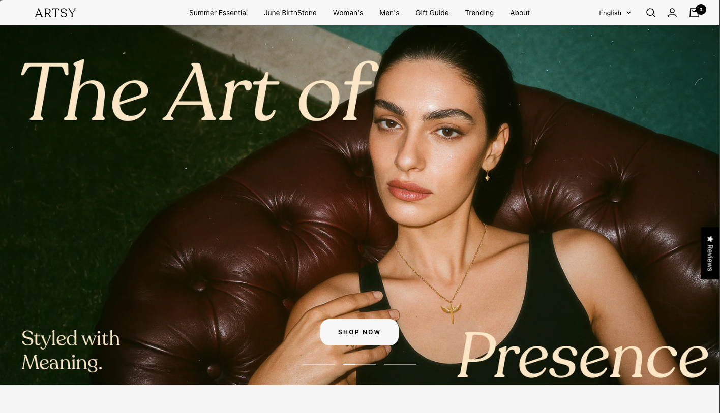
“The Art of Presence” is a poetic visual campaign crafted for Artsy Jewelry, centered around the idea that elegance begins with presence — not appearance. Through refined styling, expressive poses, and meaningful jewelry details, the campaign captures quiet power and personal symbolism.
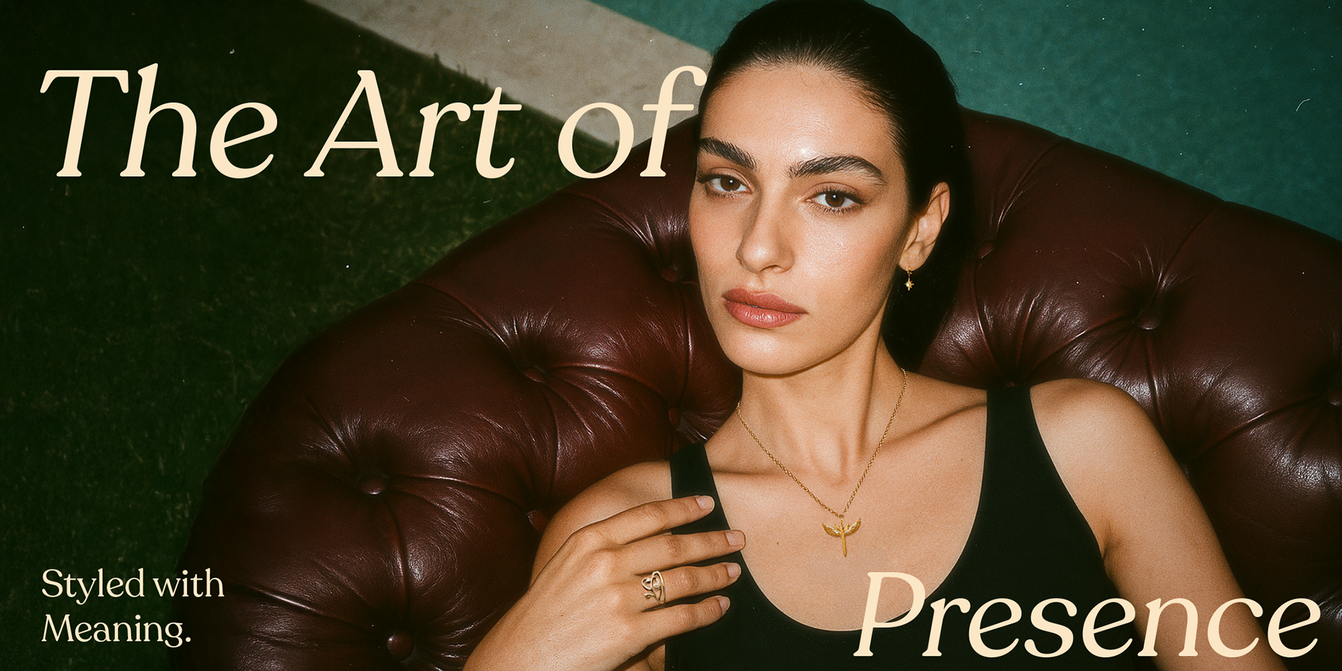
Concept: A cinematic editorial scene. A woman lounges in vintage leather, her gaze grounded and present. Jewelry is not just styled — it’s held with meaning.
Typography Direction: Modern serif with high contrast, invoking classic editorial tones.
Text: “Styled with Meaning. The Art of Presence.”
Typography Direction: Modern serif with high contrast, invoking classic editorial tones.
Text: “Styled with Meaning. The Art of Presence.”
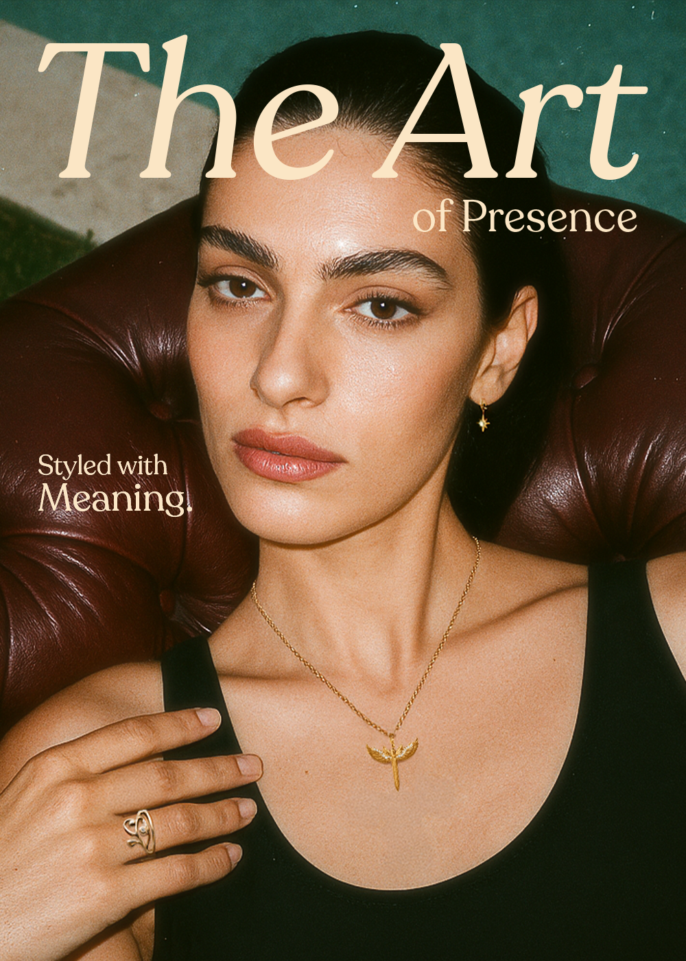
Purpose: Mobile-friendly version of the hero visual for web, posters, or Instagram.
Art Direction Highlights
Lighting inspired by early 2000s runway photography
Luxury jewelry emphasis: gold finish, soft flash texture
Posture, gaze, and styling designed to evoke intimacy and elegance
Vintage-modern editorial balance
This campaign was developed as a creative direction study for Artsy — a brand rooted in personal storytelling through jewelry. AI tools were used to visualize the concept, with direction led entirely by Misk, from pose planning to type pairing.
This campaign was developed as a creative direction study for Artsy — a brand rooted in personal storytelling through jewelry. AI tools were used to visualize the concept, with direction led entirely by Misk, from pose planning to type pairing.